Last Updated: July 03, 2024
Form Builder
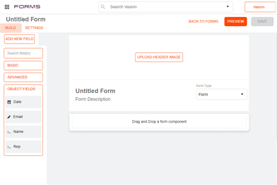
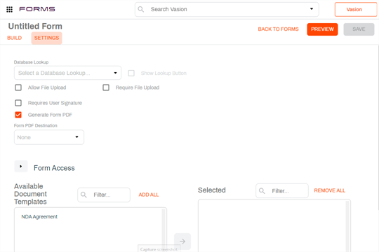
The Form Builder is divided into three main sections.
- Header — where you enter the name of the form and the navigation buttons for form preview, save and to return to the main forms menu.
- Build — a tab that displays the fields and components, grouped by Basic, Advanced and Object Fields. The form design area is on the right.
- Settings — a tab that displays the form configuration settings, which include access permissions.
Form Fields and Components
In addition to Object fields, you can use form fields and components to enhance the layout of your forms. Any field components that you add to a form to capture data, the data is not mapped to the object; it only saves to the form itself and the generated PDF, if applicable. You can also add layout components to enhance the look of your form.
Below is a brief overview of the most commonly used components.
Advanced Components
Use layout components to display information about your form or to display your data fields in different ways. You can find the layout components by selecting the Advanced section.
Content
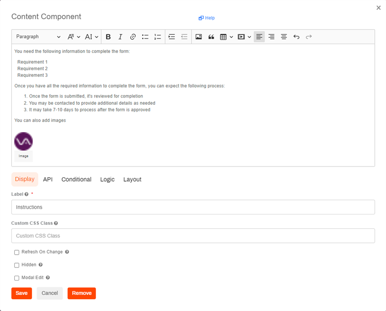
Use the Content component to provide details or important information about your form. The information you enter here is for display only and is not saved to the object. You can format the text using the tool bar buttons and insert images.
The following is not supported:
- Display of bullet character
- Tables
- Embedding video
Columns
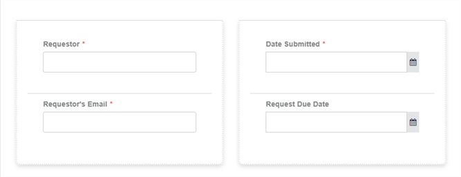
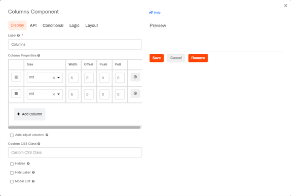
Use the columns component to display fields in columns next to each other. Once you have the column component configured with the number of columns you want to display, drag and drop object fields into the columns.
Data Grid
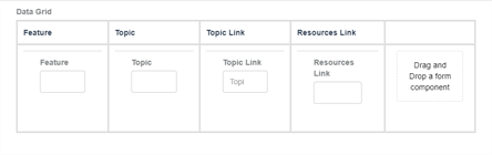
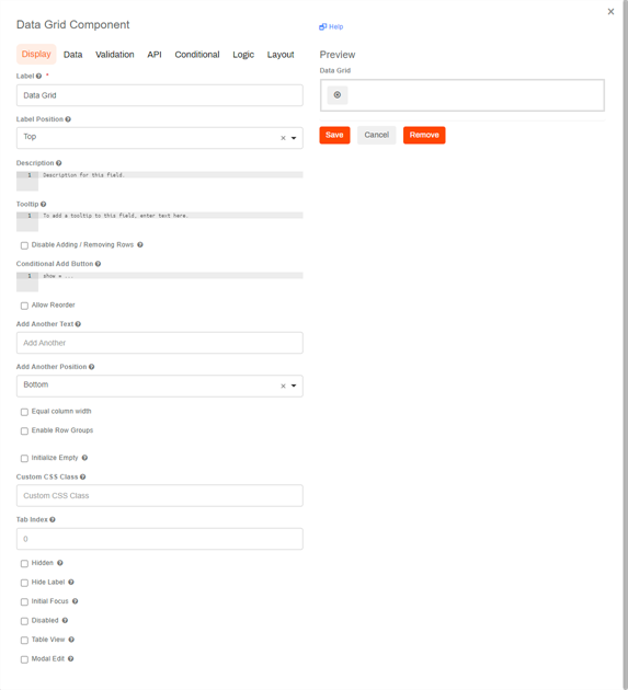
If your object is configured to collect line item data, you can add a data grid that displays as a table. You can add the data grid component and then drag and drop the line item fields into the data grid.
File Component
The file component places an upload widget so users can drag-and-drop, or browse for, files directly from the form. These files become file attachments to the form and can be accessed using the Attachments button from the Document toolbar on the Document Viewer.
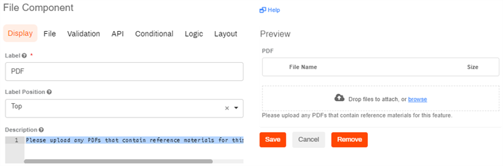
If you allow multiple file types in your configuration, you can specify labels for the file types to classify the uploads. The user completing the form can select the type of file they're uploading.
To restrict the upload to specific file types enter the file pattern into the appropriate field separated by commas. For example .jpg,.png,.tiff,.pdf
You can also set minimum and maximum file sizes.
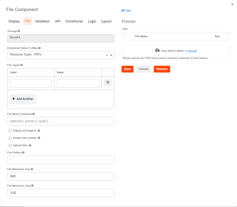
To enable the File upload widget the following is required:
-
Create an object drop-down field and include at least one value to map to the file upload widget.
The recommended practice is to disable the Allow Multiple Values option when you create the drop-down field.
-
On the File Component modal, select a value from the object drop-down field you created.
-
Configure any other attributes, as necessary.
Object Fields
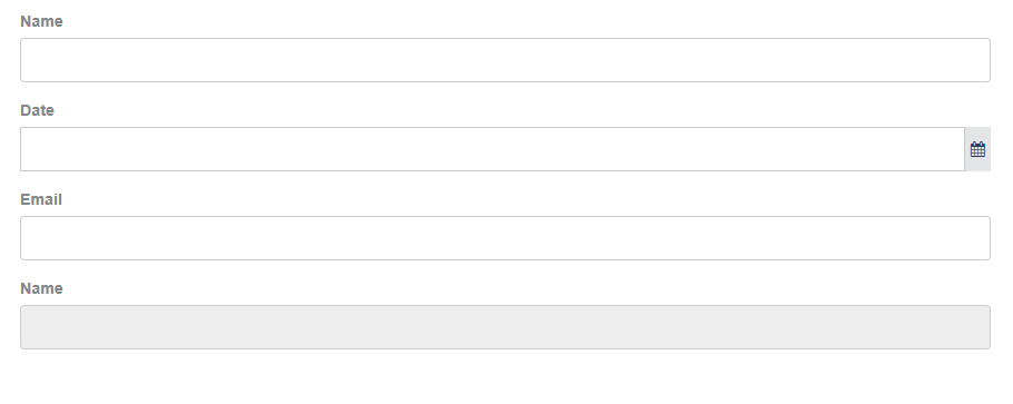
The Object Fields section shows the list of fields you created. The data captured in these fields is available for other contextual use, like workflows and reports. You can drag a field into a form more than once, however, when completing the form, the user can only enter data in the first field location. Any subsequent placements of the field are displayed as read-only.
Dropdown Filters
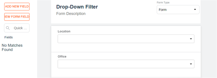
To add a dropdown field filter do the following:
- Drag and drop the dropdown field you want to use as the filter.
- Drag and drop the dropdown field with the values.
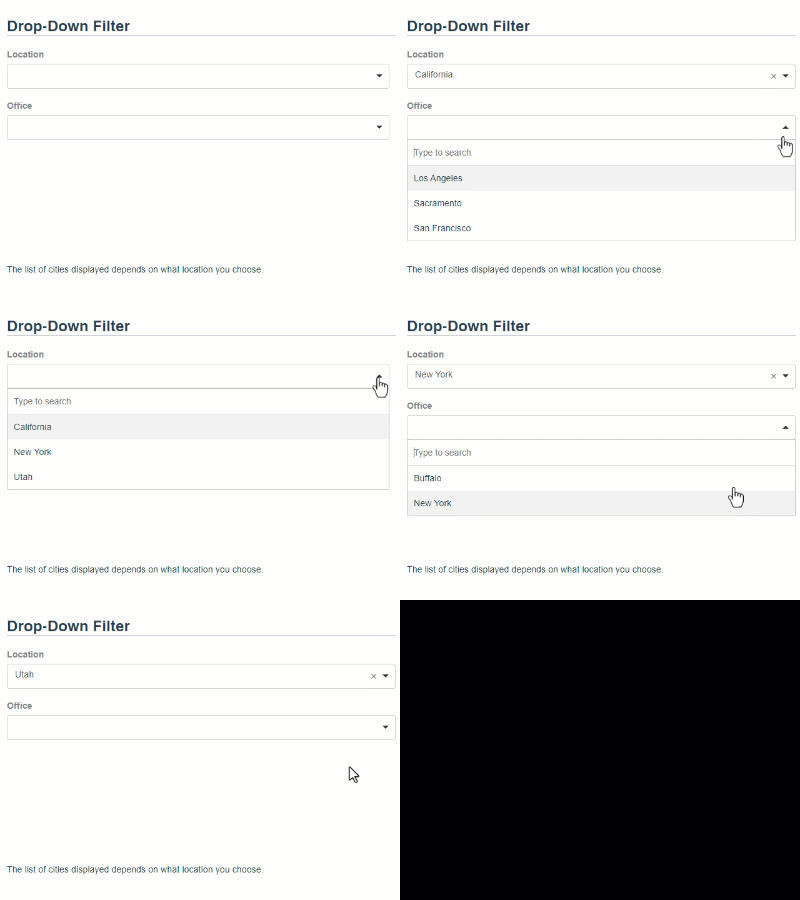
When completing the form and the user selects an option from the dropdown filter, the values field displays the appropriate options based on the filter selection.
Text Field Components
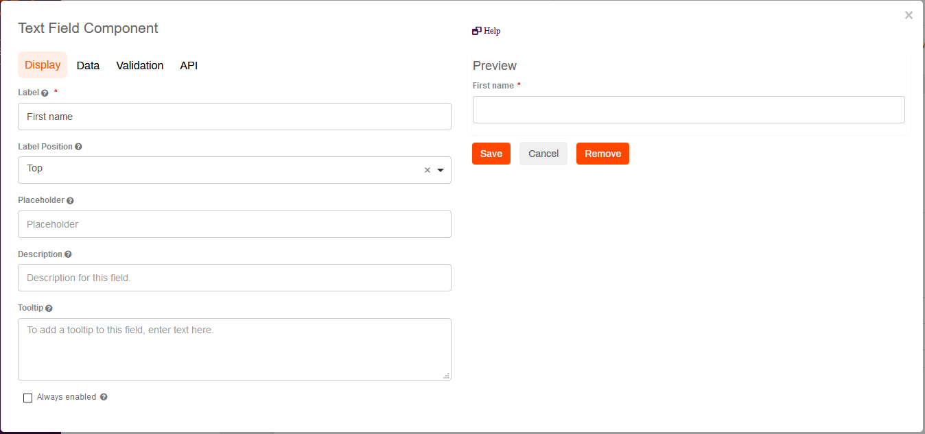
Text field components can collect information and save it to the form and generated PDF, but the data is not mapped to any of the object fields. You can add text fields by selecting the Basic section. When you drag a field into the form, you can configure various settings. The Display settings are shown by default.
- Text Field — this field accepts alphanumeric characters and the content displays on one line. Best used for short descriptions.
- Text Area — this field accepts alpha numeric characters and the content displays on multiple lines. Best used for long descriptions. You can set the number of lines to display in the Display tab by changing the number in the Rows field. the default is 3.
Display
The Display options determine how the field displays to end users in the form. Required items are noted by the asterisk(*) character.
- Label — by default, this field displays the field label entered when the field was created. You can update the field to display something else, if desired.
- Label Position — use the drop-down to select where the label is displayed in relation to the field. You can display the label above or below the field.
- Placeholder — enter the text that displays to the user when the field is empty.
- Description — enter a detailed description of what should be entered into the field.
- Tooltip — display a small "?" icon to the end of the label. When a user hovers the pointer over it a pop up shows what is written in this field.
- Input Mask — displays a pre-defined format in the fields to help the user when entering data; for example a telephone mask (999) 999-9999. When using this option, the user must enter the predefined characters and those are saved with the numbers.
- Display Mask — helps to display the input in a readable way but does not save the mask characters. In the telephone example, as the user enters the numbers, the field displays the predefined characters without the user having to enter them and only the numbers entered are saved.
- Autocomplete — allows the browser to automatically fill in information where applicable. The default is on.
- Vasion Field Name — shows the name of the object field associated with the current field. If the field name is blank the data is only saved on the form and the generated PDF.
- On the right side of the modal, you can see a preview of the field. Once the field options are configured, click Save.
Data
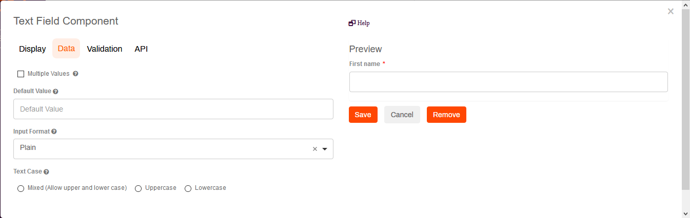
- The data options include:
- Multiple Values — check the box to allow multiple values to be entered in this field.
- Default Value — enter a default value for the field. The default value overrides the placeholder text.
- Input Format — use the drop-down to select the output of this field into a specific format.
- Text Case — click on a radio button to select a specific case for the text to display.
- The right side of the Data modal displays a preview of the field. When you're satisfied with the field, click Save.
Validation
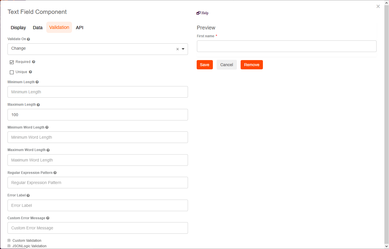
- The validation options include:
- Validate On — use the drop-down to select an option that determines when the component should trigger front-end validation.
- Required — check the box to make the field mandatory for form submission.
- Unique — check this box to force the entry in this field to be unique and not previously submitted.
- Minimum and Maximum Length — enter the minimum and maximum number of characters that must be entered into this field.
- Minimum and Maximum Word Length - enter the minimum and maximum number of words that must be entered into the field.
- Regular Expression Pattern — enter a regular expression pattern test to pass prior to form submission.
- Error Label — enter the label to display if there is an error with the content.
- Custom Error Message — enter text to display as a custom error message if an error occurs.
- The right side of the Validation modal displays a preview of the field, When you're satisfied with the field, click Save.
API
The API settings are used to document the name of this field in an API endpoint.
- API — enter the property name for the field.
- The right side of the Validation modal displays a preview of the field. When you're satisfied with the field, click Save.

Yes, Vasion-host users can drag and drop eSignature fields into PDF Forms. The indicated end-user will be prompted to sign their name.
PDF Forms support multiple drag-and-drop field types, including text, numbers, passwords, eSignatures, email addresses, phone numbers, date and time, and currencies.